Mapping Fires with Satellite ImageryBy David Milne The standard method of mapping fire perimeters is from the air. An observer in a plane or helicopter circles over the fire, drawing it freehand on a topographic map. Effective mapping with this method requires that the mapper be highly skilled at recognizing features on the ground and interpreting the topographic map. Consequently, the hand-drawn boundaries are often inaccurate in shape or location or both. In addition, some fires are mapped midway through the season and are not revisited, which results in a misleading fire boundary. The satellite image method of mapping fire perimeters uses Landsat Thematic Mapper (TM) scenes, with a pixel resolution of 30 meters on the ground. The burned areas are discernible on the image, and the boundaries are digitized by tracing around the burned areas with a mouse. The digital file is captured in a geographic information system (GIS) program. Depending on the age of the fire, the burned area can usually be recognized easily. Fires older than about 15 years become difficult to interpret, although this varies across the Yukon. Fires 1 or 2 years old are the clearest. The Satellite Image Method |
Click on each image to enlarge.

|
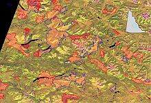
Step 1: Georectification
The Landsat TM satellite scene is rotated and stretched to “fit” the real world as it is represented on the map. The red areas in this scene from the Carmacks area depict fires ranging in size from 2000 hectares to 60 000 hectares. Other data layers, such as roads and water bodies, can be overlaid on the image to check the quality of the georectification. The Yukon River runs through the center of this scene, veering off to the northwest. Click on the image to see a larger version. |
|
Step 2: Digitization
A mouse is used to trace digital lines around the burned areas. Each fire is stored as a separate fire polygon in a GIS computer file. These polygons are also labeled with the fire year and an identification number. |
 |
Step 3: Display of Fire Polygons
The resulting product can be used in conjunction with other GIS layers to display a highly accurate map of the burned areas for the given time period. This technology has proven to be an efficient and cost-effective method of mapping recent fires. |
|
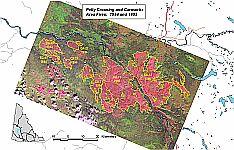
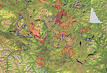
The following pairs of images demonstrate the effectiveness of using Landsat TM imagery to map fires. The first image in each pair shows the landscape with the original fire boundaries overlaid. These boundaries were acquired mostly from fire report sketch maps (the perimeter mapping method). The second image in each pair shows the same view with the new satellite-determined fire boundaries overlaid. The burned areas appear red or pink. The darkest red patches are fires within a year or two old. The red boundary lines are for fires dating from 1990 to 1999.
The blue lines are for those from 1980 to 1989. The Mayo and Ross
River satellite images were taken in early August 1999. The Watson
Lake image is from early September 1997.
Click on each image to see a larger version.
|


In Figure 1, both A and B represent the 1999 Dawson fire DA-02. Figure 1A represents the burned area mapped using the perimeter mapping method; Figure 1B represents the burned area mapped by satellite imagery. It is clear that much of the area within the fire perimeter line of Figure 1A is actually unburned. Forests typically burn in an uneven, patchy pattern, leaving islands of mature and semimature forest of different sizes and shapes (Figure 2). These islands provide the habitat mosaic that many wildlife species require. Most of the fires in the data set used for the Yukon Fire History Atlas have been mapped using perimeters only, as this is by far the most convenient method to describe a burned area. To compare the actual burned area to the area estimated within a fire perimeter, satellite imagery can be used as a benchmark. The satellite can discriminate effectively between burned and unburned areas within a fire perimeter. The following burned area estimation analysis is for the Dawson area for the 1999 fire season. The table below presents the burned areas for each of the two methods. It is apparent even with this small sample that the perimeter mapping method significantly overestimates the actual area burned. |

Figure 1
|

|
Fire |
Area burned from perimeter mapping (hectares) |
Area burned from satellite imagery (hectares) |
Percent overestimation |
|
8 080 |
5 930 |
36.2% |
|
|
30 200 |
22 420 |
34.7% |
|
|
7 510 |
6 380 |
17.7% |
|
|
32 450 |
25 555 |
27.0% |
|
|
17 040 |
12 410 |
37.3% |
|
|
95 280 |
72 695 |
31.1% |
| Click on the links in the table to view images depicting the results
of the two methods. As in Figure 1, the left-hand image in each pair
shows the results of the perimeter mapping method used to calculate
the area of each fire. The right-hand image shows the actual area
burned as determined from Landsat imagery. The black “pixels”
represent burned areas.
Top of page |